
- Learn how to read and interpret candlestick charts, a popular trading technique used in various markets, including the crypto market
- Discover the history, components, and reliability of candlestick patterns for successful trading
A candlestick chart is a style of financial chart used by traders to determine possible price movement based on past patterns.
This technique is used by many markets worldwide, including the crypto market. But what exactly is a candlestick chart, and how does it work?
The history of candlestick charts
Candlestick charts were first developed in 18th century Japan for rice trading. At the time, rice merchant Munehisa Homma discovered that there was a link between the price, supply and demand for rice. From there, he devised a system which identified repeating patterns and trends in pricing.
Homma’s main desire was to understand the “psychology of the market”. He did this by studying past prices of rice in order to identify traders’ behavioural patterns. It was later discovered that the psychological element in trading plays an essential role in successful operations and that the emotions of traders had a significant influence on the value of rice.
This technique became extremely successful in Japan and was introduced to the Western world in 1991 by Steve Nison through his book, “Japanese Candlestick Charting Techniques”.
Fast forward to today, and candlestick charts are still widely used by traders. They’re considered to be powerful trading concepts, as some candlestick patterns have a high predictive value and can result in positive returns.
How to read a candlestick chart
A candlestick chart’s price action is made up of four components: the open, close, high and low.
The “open” section refers to the price of an asset when the trading period starts, whereas the “close” shows the price when this period has come to an end. Meanwhile, the “high” and “low” represent the highest and lowest prices attained during this trading session.
Candlestick charts also use two physical features to display the four components. These are known as the “body” and the “wick”.
The “body” is the midsection of the candlestick that illustrates the open and close during the trading period, whereas the “wick” displays the high and low in the form of thin lines extended above and below the candlestick body.
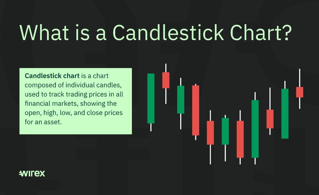
As you can see from the image above, a candlestick can be either green or red. A green candlestick represents a bullish market, meaning its current or closing price has increased above its opening price. On the other hand, a red candlestick means that the market is bearish and that the current or closing price has declined below its opening price.
Are candlestick charts reliable?
A candlestick chart’s reliability depends on several factors, including the market you trade in, the timeframe, the candlestick pattern and the pattern size.
There are around 30 different candlestick patterns out there, all with different levels of reliability. TradeSmart lists the following five as its most dependable patterns: one white solider, engulfing patterns, dragonfly doji, evening star and rising three. You can see what these patterns look like here.
Additionally, candlestick charts with short timeframes tend to be less reliable due to high volatility, whereas daily and weekly timeframes are more likely to give you a more dependable and long-term result.
Overall, candlestick charts are useful for providing a simple and easy-to-understand visual from which traders can determine the current state of the market, see the direction of the market and quickly identify patterns. They also provide more detailed information than a bar or line chart.
Once you can read a candlestick chart, you’ll soon understand what the patterns are showing about the underlying market dynamics, trader behaviour and whether buyers or sellers are in control of the market.